
Overview
As Head of Product Design, I led the creation of Rise, a unified design system aimed at improving collaboration, reducing inefficiencies, and delivering a cohesive user experience across all touchpoints. This effort was not just about building UI components but about transforming workflows, ensuring design consistency, and embedding a scalable design language that enhanced usability and accessibility. By unifying patterns and interactions across multiple brands and platforms, we aim to create a shared language between design and engineering—giving teams a common foundation to work more efficiently, build faster, and deliver a seamless, intuitive experience for users.
My Role
Strategic Leadership & Vision
Securing Investment & Building a Business Case
Managing External Partnerships
Cross-Functional Orchestration
Delivery & Adoption Strategy
- SLT Management
Teams
- Product Design
- Product
- Engineering
- Brand & Creative
- Marketing
- Legal
Year
2023 - Ongoing
The Problems
As NewDay grew, inconsistencies in design and development became more pronounced. More recently, the company was transitioning to a PaaS business model, which introduced the need for a multi-tenancy product portfolio. To support this shift, we required a design system that could scale while maintaining both structure and flexibility. However, without a unified system, each product team built and maintained components differently, leading to challenges such as:
1. Duplication of work
Designers unknowingly recreated patterns that already existed elsewhere in the organisation.
2. Technical inefficiencies
Engineers spent time maintaining multiple variations of the same or similar components.
3. QA bottlenecks
QA teams had to validate multiple versions of the same UI elements, adding to testing complexity.
4. Slow onboarding for new clients
Customising the UI for new clients was taking weeks to release and lacked flexibility.
5. Multi-brand complexity
The design system needed to cater for 20 brands, ensuring unique branding while maintaining consistency across iOS, Android, and Web.
6. No structural balance
The system needed to avoid becoming an unmanageable overhead of bespoke components while still providing flexibility.
7. Slow client customisations
Clients needed the ability to re-brand the PaaS solution while maintaining system integrity.
8. No cohesive UX
Users faced inconsistent UI elements, interactions, and branding across their credit journey, causing confusion and friction.
Inconsistencies across the product portfolio
Our Vision & Mission
To ensure the success of Rise, I worked closely with my team and product, brand, marketing and engineering leaders to assess the current landscape, align on shared objectives, and define a structured approach. Together, we crafted a shared vision and a mission that addressed immediate challenges while setting the foundation for a scalable and adaptable design system.
The Vision
A unified design system that enables teams to create seamless, accessible, and high-quality experiences for our users, while maintaining brand flexibility.
The Mission
To create a system that’s as collaborative as it is scalable—bridging design and engineering, reducing rework, and giving teams the clarity, structure, and flexibility to ship better products, together.
Securing Investment
Prior to RISE, I attempted multiple approaches to establishing a design system internally, but each failed due to competing priorities and resource constraints. Initially, I introduced a 'side-of-desk' approach, where teams worked on the system in their downtime, but this lacked dedicated focus. I then introduced SME champions across product teams to drive consistency, but without clear governance, it failed to gain traction. A dedicated task force was formed just before onboarding a new client, but increasing demands on product teams prevented meaningful progress. Recognising the need for external resource to drive momentum beyond internal constraints, I built a business case to justify investment in working with an external agency, demonstrating the payback period and tangible business and user benefits, focusing on two key areas:
Cost Savings
By reducing redundant work, we could save significant design and engineering hours.
Formula: Cost Savings = Total Time Saved (hours) × Avg. Hourly Rate (£)
Example Calculation:
If the average salary of a designer/engineer is £80,000 and they work 1,600 hours/year, their hourly rate is:
£80,000 ÷ 1,600 = £50/hour
With 1,188 hours saved per quarter:
1,188 × £50 = £59,400 per quarter
Annually, this results in £237,600 in savings.
Sprint Efficiency
I also calculated how reducing inefficiencies could improve sprint velocity.
Formula: Sprints Saved = Total Time Saved (hours) ÷ Sprint Length (hours)
Example Calculation:
If a sprint consists of 80 hours per person and we have 33 people:
80 × 33 = 2,640 hours per sprint
With 1,188 hours saved per quarter:
1,188 ÷ 2,640 = 0.45 sprints saved per quarter
Annually, this translates to 1.8 sprints saved per year, per team.
Scaled Organisational Impact
Using the example calculations above, when scaled, the impact grows significantly.
Assumptions:
- 18 product areas
- 3 squads per area = 54 squads
- 6 people per squad
- 1 sprint = 480 hours
Annual Time Savings:
- 1.8 sprints × 54 squads = 97.2 sprints
- 97.2 × 480 = 46,656 hours saved
Estimated Cost Savings:
£50/hour × 46,656 hours = £2.3M annually
Headcount Equivalence:
46,656 ÷ 1,600 = 29 FTEs worth of time saved
Discovery
After a successful business case pitch to the CEO, I had secured investment to engage with an external agency. The agency provided the expertise to conduct research, discovery, perform audits, and define the technical and design requirements necessary for a scalable system foundation.
I managed the engagement with the external agency, ensuring alignment with our vision and ensuring collaboration with the right people at the right time.
During discovery, the aim was to assess the current landscape and identify the foundational elements needed to support a cross-platform design system. Our activities focused on uncovering inefficiencies, aligning tools and processes, and setting the groundwork for delivery.


Stakeholder Interviews
We interviewed product owners, engineers, designers, and brand representatives to uncover workflow inefficiencies, inconsistent patterns, and pain points. These conversations helped surface real-world challenges and informed early priorities for the system.
We spend too much time duplicating effort across teams—every squad solves the same problem slightly differently, and it's costing us delivery speed.
Every project ends up rebuilding the same components with minor differences. There’s no single source of truth or consistency in how things are built.
I constantly have to recreate buttons, modals, or icons because I’m not sure if what already exists is correct, up-to-date, or even being used anywhere.
Our digital experiences don’t reflect our brand consistently. The colours and typography work in print, but they’re not accessible or scalable across digital products.
UI Framework Exploration
Web - While the initial expectation was to build bespoke components, we explored the trade-offs and quickly recognised the greater benefits of using an off-the-shelf UI framework. We conducted a comparative analysis of Chakra UI and Tailwind, evaluating scalability, performance, ease of integration, and long-term maintainability. The strong documentation, active communities, and regular updates offered by established frameworks made them a compelling choice. Ultimately, we aligned on Chakra UI as it reduced team overheads and supported faster delivery without compromising quality or flexibility.
Mobile - To ensure seamless integration with platform-specific guidelines and reduce overhead with mobile, we made the decision to adopt native iOS (Human Interface Guidelines) and Android (Material Design) components where applicable. This decision was informed by early stakeholder interviews and the UI audit, which revealed platform-level inconsistencies and usability challenges that native components could address effectively.
Strategic Refinement: Preparing for Delivery
Following the completion of the external agency's work, I started transitioning Rise into its next phase. I began putting in place key initiatives and frameworks to support the shift from discovery to delivery. Having validated the opportunity and early impact of RISE, I secured approval to hire a dedicated product designer to support its continued growth and implementation.
With an incredibly talented new hire in place (Mike Simpson), we began shaping the delivery strategy into a practical execution plan:

Phased Rollout Approach
The rollout of components was to be split into two phases: Dependencies and Feature-based. Dependencies encompassed the core foundational elements that everything else would be built upon. Once these were in place, we could begin to develop fully-fledged features. This structured approach allowed us to align effectively with product teams' roadmaps without disrupting business-as-usual activities.

Design System Roadmap
A structured roadmap was created that aligned with the Dependencies and Features plan. This roadmap provided a clear view of what would be delivered, when, and how it aligned with product and engineering roadmaps. It ensured smooth coordination across teams and allowed product managers to anticipate and prepare for upcoming changes.

JIRA Board & Agile Framework
I created a new JIRA board and began breaking everything down using the Jobs-To-Be-Done (JTBD) framework. These were translated into EPICs on the board, with each EPIC refined into key stories that would be played in sprints. It was important to treat Rise as a product, adopting agile methodologies, including two-week sprints, a backlog, and weekly ceremonies to track progress and maintain alignment.

Visual Identity & Branding
A comprehensive visual identity and branding framework was created to support the system's credibility among product teams. By treating Rise as a standalone product, this strengthened its perceived value, ensuring it was recognised as an essential, long-term investment rather than just another internal initiative.

Objectives and Key Results (OKRs)
With a clear understanding of inefficiencies, I established measurable OKRs to guide decision-making as we moved through the phased approach. These objectives ensured our efforts were aligned with business goals and provided a framework to measure success post-launch.
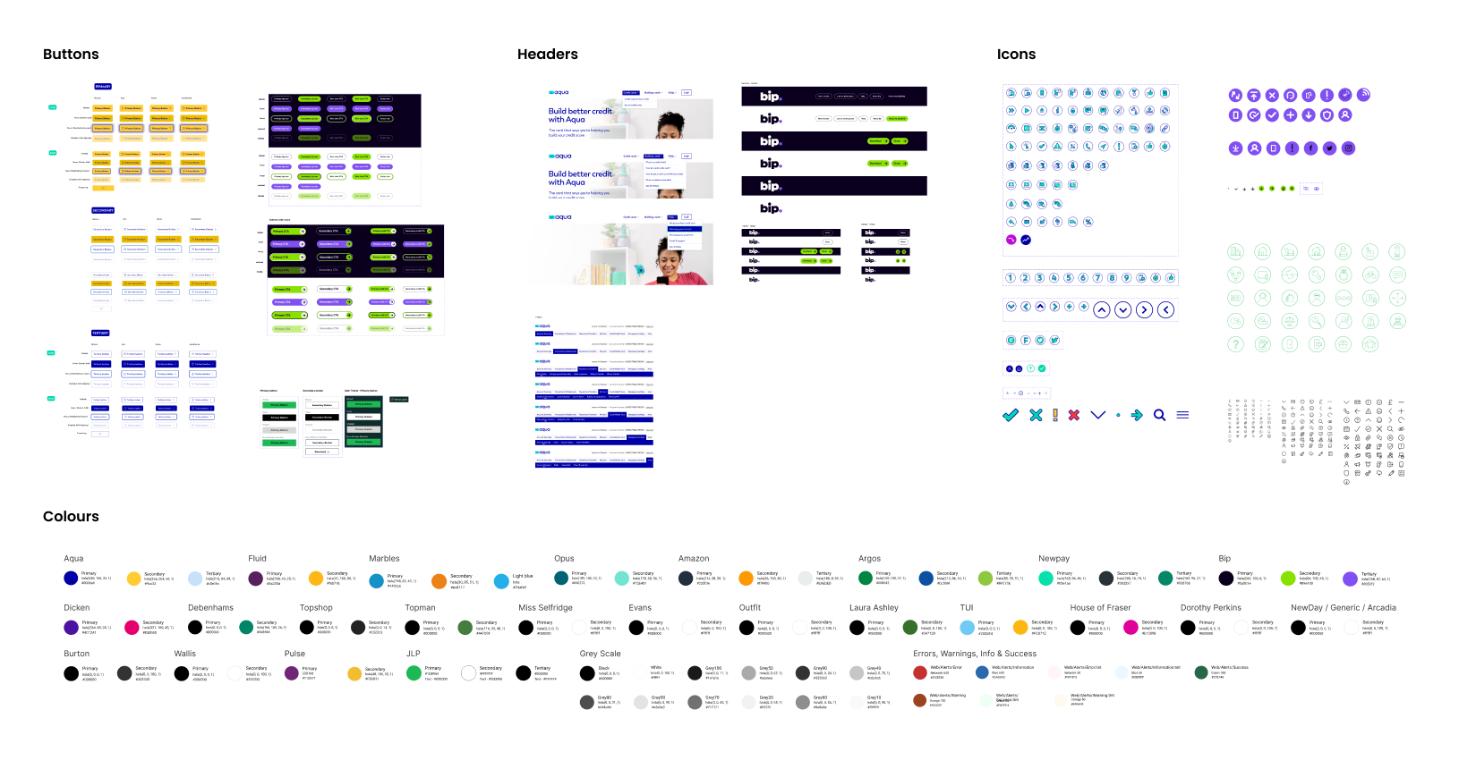
Building Rise
With a lengthy backlog and clear roadmap in place, we moved into delivery. This phase focused on operationalising the system—translating our design principles, token structures, and early strategy into tangible outputs. Our goal was to build phase 1 dependency components that would scale reliably across platforms, integrate cleanly into product workflows, and reflect the system's visual and functional standards. What followed was a phase of continuous execution, refinement, and implementation.

Design Tokens
A robust set of tokens formed the connective tissue between design and engineering. Using Style Dictionary, we delivered Web, iOS, and Android token versions to drive visual alignment, support modular design, and adapt to brand needs. This made updates easier to manage and ensured a cohesive experience across platforms and teams.


Implementation & Promoting Adoption
To maintain momentum and prevent delays, we adopted an iterative delivery approach—while building new components and updating the token library, we actively pushed these updates into product teams for implementation. This approach allowed us to effectively 'build the car while driving,' ensuring a continuous stream of improvements without disrupting product development.
To ensure adoption momentum, I drove the implementation of:

Onboarding Workshops
Hands-on workshops tailored for designers, engineers, and product managers. These sessions provided practical guidance on integrating Rise into workflows, covered best practices for using design tokens, and introduced strategies for scaling the system across multiple brands. The workshops included interactive exercises, live demonstrations, and Q&A sessions.

Overcoming Roadblocks
Establishing a new product is never easy, teams encountered several challenges along the way that required solutions:
Framework Divisions
Some engineers preferred Chakra-UI, while others advocated for Tailwind. We addressed these disagreements through discussions, workshops, and POC implementations to determine the best approach for scalability and maintainability. Ultimately after a long list of pro's and cons we agreed on Chakra-UI.
Version Control
Managing updates consistently across Figma, documentation, and code presented a challenge. After a short spike, we decided upon Supernova’s built-in version control for documentation, adopted Figma branching for controlled component updates, and centralised code updates in GitHub, ensuring all product teams pulled the latest design tokens and components from a single source.
Framework Compatibility
Some of our web products were built in Angular, while Rise was to be built using Chakra-UI, a React-based framework. Since React does not integrate seamlessly with Angular, we prioritised compatibility by first rolling out Rise to products already using React. We then collaborated with engineering teams to incrementally migrate older Angular-based products to React, implementing the transition page by page to minimise disruption.
Web Accessibility
While collaborating with the brand team, it became clear that many brand palettes and assets—particularly across our six internal brands—had been designed primarily for print, leading to issues when translated to digital. We worked together to define accessible digital colour ramps, select web-safe fonts, and craft scalable SVG versions of brand logos to ensure digital readiness.
Outcomes
Over the first three months since the initial roll-out in June 2024, we observed significant improvements. With the completion of the roll-out aiming for the end of Q2 2025, these were promising results.
reduction in design related accessibility defects
increase in squad sprint velocities
adoption of Rise in web & mobile products
in annual efficiency
savings
design tokens meticulously crafted
brands fully accessible with digital theme kits
button instances being used across teams
component insertions into Figma files
Additional Benefits:
Theme Switching in Figma & Code – Designers can now design once and export brand variations instantly and Engineers can switch between themes seamlessly in code using Storybook.
Conclusion
Rise is already changing how NewDay approaches product delivery. It's addressing real pain points—fragmented design, duplicated work, and inconsistent user experiences—by introducing structure, shared standards, and clarity across teams. It’s not just about components; it's about enabling teams to move faster, collaborate more effectively, and make better decisions. Rise is becoming a practical, everyday tool that drives better outcomes for both the business and our users.